
Dining Room and Breakfast Room Updates
6:00 AM
Let's start at the very beginning. A very good place to start.
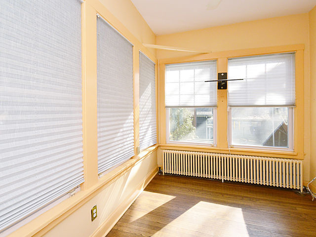
Here is our dining room as pictured in the real estate photographs. Much lighter and brighter in this picture than in reality, but a pretty good representation.
Pretty neutral and not terrible. Just kinda...bland? Definitely not bad, just too neutral. Light grey below the chair rail and a cream above. I knew I wanted to paint it, but I just wasn't sure what direction to go. We'll come back to that.
Looking through to the breakfast room...
Not even a little neutral. Orange. Tangerine. Horrible. Awful. Repellent. Nothing was spared this color...not the trim...not the radiators...

The TV mount was removed in the "Great Removal of 2016" post-move-in.
Because this isn't a hotel and we will not be mounting a television in any room of our house. The diagonal piece of wood across the windows also went away.

I like color. I can get behind white rooms when they're done right, but it will probably never be a principal look I go for simply because I really do love color. Not just for the sake of color, but because rooms with color seem to have more personality to me. I tend to steer clear of warm colors, though. I'm not a big fan of reds, oranges...I did use a brown in my old bedroom and I liked it, but overall, I gravitate toward cool colors. Blues in particular.
I'm also usually pretty decisive about colors based on how they make me feel - many of the colors I used in our Goshen house gut punched me almost with how much I loved them.
I want to view this Chase house as a fresh start, though. Not rely on colors I've used in the past, unless they just really work in a space. And for some reason, it's been really really hard for me to make up my mind about which direction to go!

Now, the breakfast room is pretty small and gets a lot of light. I'm also thinking it may not be used as a breakfast room, but possibly rather a painting room. So while it could handle a dark color, I wanted something more reflective simply because I wanted to use the light.

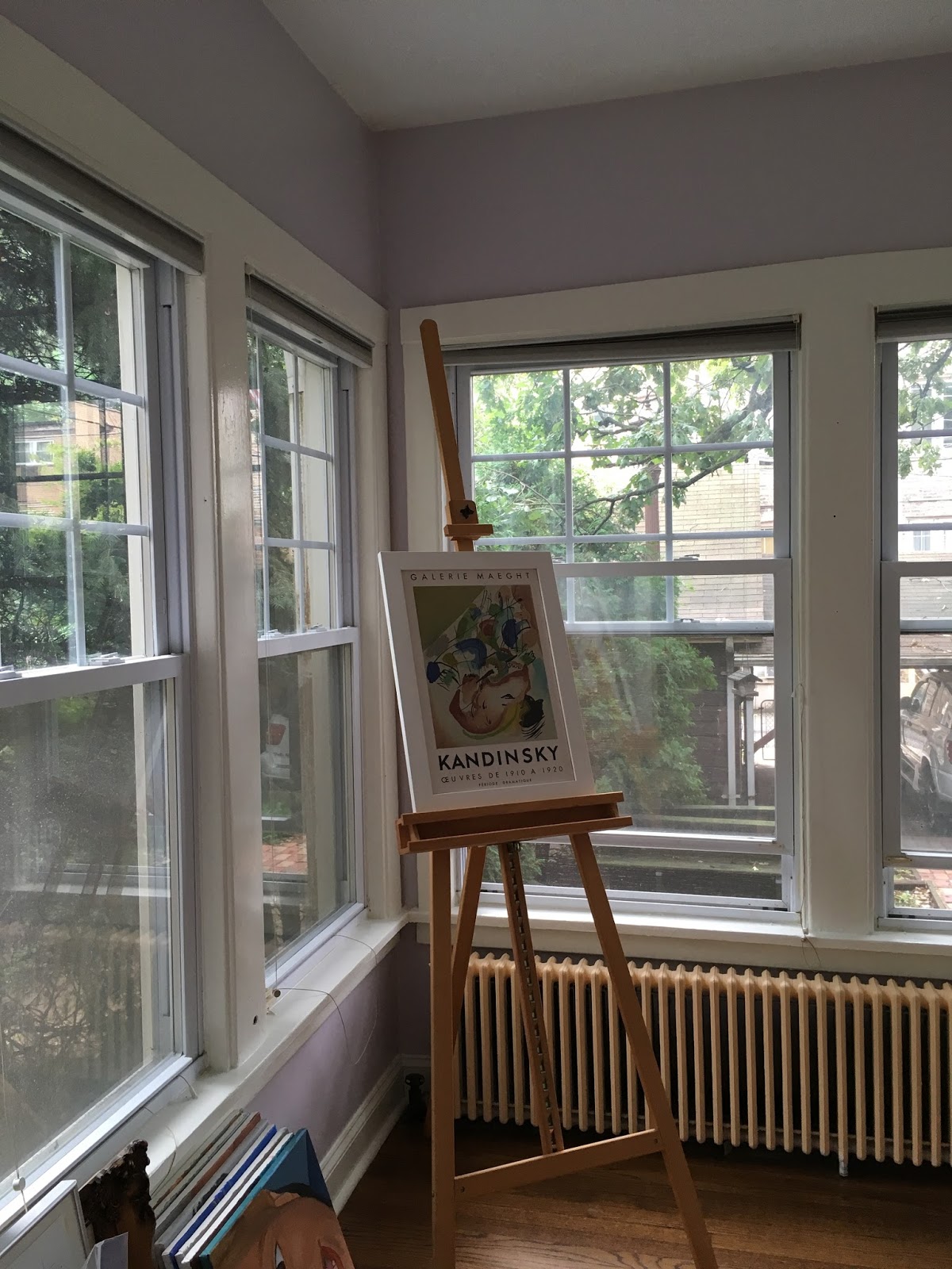
I happened upon the Farrow & Ball color Peignor (shown above in the picture with the white side table) and really loved it. It's almost pink, but also purple and very calming. But I can't justify paying almost $100/gallon, and unfortunately it was a color Sherwin Williams couldn't find a color match for, so I ended up picking a similarish color on the fly one day at SW, and I am very pleased with it.

Just eye-balling it, it looks pretty darn close to Peignor.
It's SW 6547 Silvery Peony. We also painted the trim SW Simply White. And that orange trim was very resistant to being painted over. It required at least 3 coats. Man.
And we have yet to tackle the radiator, because it's gonna require spray paint. Sometimes a room just wears you out and you need a break from it. That was Kyle's feeling after going after the trim repeatedly. Let's just come back to the radiator.

It's a vast improvement, don't you think?
A room you might actually want to spend time in.
Now, to the dining room. I have struggled SO hard to narrow down the colors I wanted. Here was my inspiration:

They used a Farrow & Ball paint, and I think the two blues on top and bottom are the same color, but the top color is an emulsion.

I told you I really love blues. I LOVE these kind of blues. Rich, inviting, layered. Even the radiator is painted a blue.

Let's not even talk about how much I want that blue velvet couch.
So, one reason I kept coming back to this particular room is that the wall has been divided into two different sections with the wainscoting, and yet, they maintained the flow of blue top and bottom.

Our dining room has a chair rail, and I have never liked chair rails. They skew traditional, and while I love old houses, I'm not "traditional" in my design sense at all. I did NOT want to have this chair rail dictate my painting of the room and it seemed to totally be doing that.
I couldn't figure out how to deal with it. I considered painting the top and bottom one color and the chair rail a different color...sort of like this...

But I just couldn't quite get there. I didn't love it. There was still a clear chair rail and it looked pretty traditional. So, I set aside the whole chair rail issue and just focused on colors.
That was no easy task. I made so many trips to the paint store just to grab handfuls of swatches. And I labored over them. Kyle was puzzled by this, because I'm usually really decisive when it comes to picking colors. I even toyed with the idea of removing the chair rail, but this house has its own ideas sometimes and I just knew that would end up being a supremely big mistake. Complicated. With the plaster walls, there's no telling what I might end up with. So I scrapped that thought.

I randomly chose a Sherwin William color, Silken Peacock and painted a swath on the dining room wall. It felt similar to the blue I liked so much in that blue room.

I lived with it for a few weeks and finally said, ok, let's do this.
I had also grabbed a second blue to pair on the bottom section and at the last minute, swapped it out for something else. Something funkier. SW Oceanside. It was a bit of an unexpected pairing, and that is what I wanted.

On went the top color (SW Silken Peacock) and it was beautiful. Instantly transformed the room.
We could have stopped there and that change would have been great, but nope. Onward we go.

 The lighting in these pictures is terrible, but we did truly have to consider that the color would look dark as this room gets morning sun and some mid-day sun, but it's not a bright room. We were ok with that.
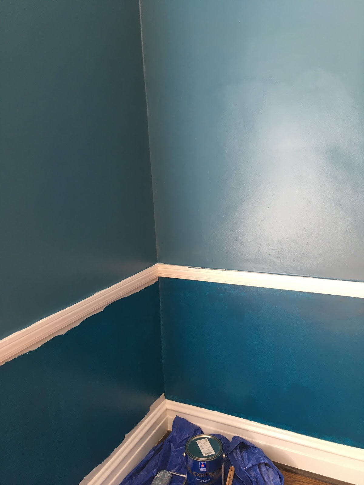
So, the first coat of the bottom color went on. It was a deeply pigmented color and would need about 3 coats to get it even, and at the time, we hadn't fully decided on how to handle the chair rails.

We sampled painting the chair rail, but it was almost too hard to tell just with a little bit. And we were still uncertain about the bottom color. We liked it, but was it the look we wanted from the start? Kyle left it up to me. He knew I had this love affair going with that blue room...

Somehow, I knew in my gut that these colors would work.
It was a risk worth taking to just keep painting.
And paint we did.

It made our white trim look magnificent, and the color of the floors looked so rich!

Looking in from the kitchen.
Finally I just said, let's paint the chair rail. The bottom color.

So we did.

Instantly, the room became exactly what we hoped for. Rich, jewel-toned, unexpected. Almost like the colors of ocean and sky meeting.

We have yet to put any artwork up, and I wish I had a lighter wood table.
But on the other hand, I love my table and am not going to sell it.
I am looking for a buffet or console table to store dishes in, so I may just find that in a lighter wood and let that add contrast to my dark woods.

My radiator is still white, for now. No immediate plans to change that.

We are all immensely pleased with the color pairing. SW Silken Peacock on top and SW Oceanside on bottom (covering the chair rail). Still need to remove the ginormous track lighting and figure out a better chandelier, but baby steps!!! I'm so happy to have two rooms painted that it makes me kind of giddy. These rooms have a long way to go yet, I know, but we're making progress.


0 comments